Modern React Components UI: Industry Best Practices for 2026
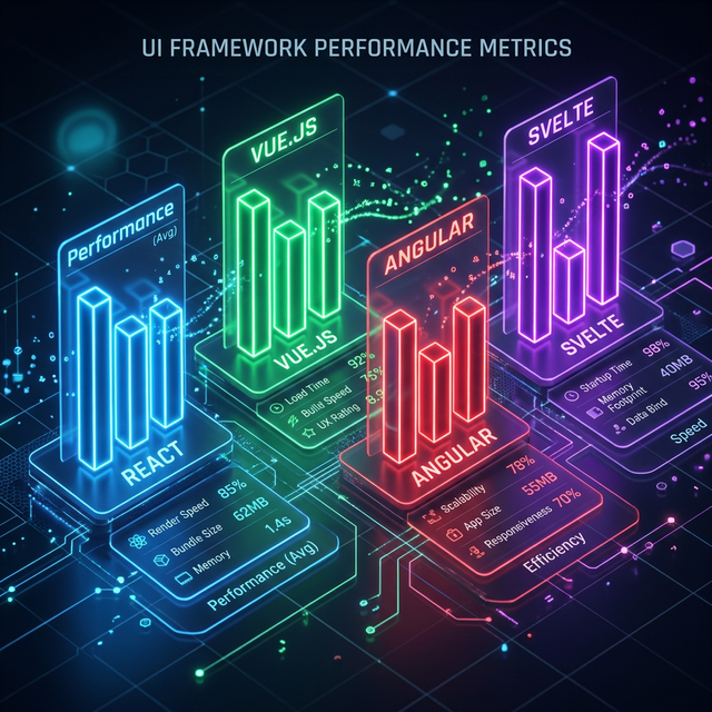
Visualizing the structural layers of a modern React UI library.
Technical Roadmap
01. The Component-First Mindset in 2026
In 2026, we don't build "Screens." We build Systems. Every part of your application—from the button in the corner to the hero section at the top—should be a self-contained, atomic component.
This mindset allows for massive scalability. If you need to update your site navigation across 50 different pages, you do it in one single component file.
02. Aesthetic Excellence: Luxury SaaS UI
A premium UI is defined by its attention to detail. This includes:
- Harmonious Colors: Using a consistent color palette across your product cards and feature grids.
- Whitespace & Grid: Giving elements room to breathe in your about pages.
- Micro-animations: Subtle feedback when a user interacts with a form input or clicks a navigation tab.
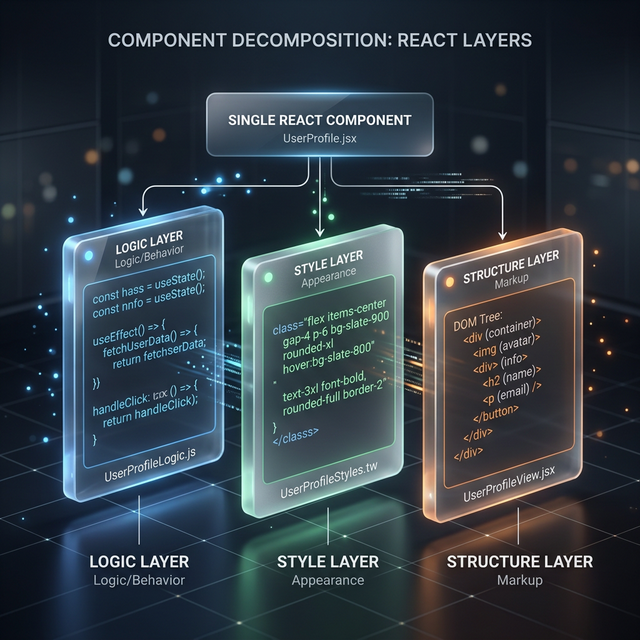
The Modern Bridge: Connects business logic to beautiful views flawlessly.
03. High-Quality Architecture: Logic vs. View
Keep your "Smart" logic (data fetching, state management) separate from your "Dumb" views (styling, layout). This is why a high-performance data table is often built in two layers: the logic engine and the Tailwind visual layer.
04. Modern Performance Benchmarks for React UI
Your UI should be as fast as it is pretty. In 2026, we benchmark for:
- TTI (Time to Interactive): Ensuring users can interact with dropdowns and FAQs almost immediately.
- LCP (Largest Contentful Paint): Optimizing the loading of your hero visuals.
- Hydration Speed: Minimizing the JS bundle needed to make the page interactive.
05. Accessibility (a11y) as a Non-Negotiable Foundation
Accessibility is not an afterthought—it's a requirement for SEO and inclusivity. Use semantic HTML and aria-labels for every button and form field. Test for keyboard navigation on your navigation components.
06. Responsive Scaling: Beyond Media Queries
A great React UI adapts to its container, not just its window. Use "Container Queries" and Tailwind hooks to ensure that your card components looks great whether they're in a wide feature section or a narrow sidebar.
07. Building for the Future: The Advantage of Owned Code
Don't be a slave to your dependencies. By using the "Owned Code" model provided by IndoUI, you own the actual code for your components. This means you can refactor or update your navigation logic without waiting for a third-party library to release a patch.
Frequently Asked Questions
How do I start building a design system in React?
Start by defining your design tokens (colors, spacing) in your Tailwind config. Then, build your atoms like buttons and inputs using those tokens.
Can I build professional-grade UI without a designer?
Yes! By starting with professional-grade component blocks like IndoUI's categories, you get the design excellence of a senior UX designer already baked into your code.
Explore Related React Components
Accelerate your development with our production-ready, accessible, and highly customizable UI blocks.
Build the Web You Want
The future of React UI is component-driven. Start your journey today with our production-ready, beautiful, and high-performance React component blocks.
Explore the Library