Building a Truly Dark-First Design System: The 2026 Standard
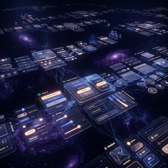
Dark Design Architecture
The Elevation Paradox
In light mode, elevation is usually communicated through shadows. In dark mode, shadows are often invisible. To communicate depth, you must use luminance-based elevation. This means higher elements (like premium UI cards or modals) should be slightly lighter than the layer beneath them.
Rethinking Color Palettes
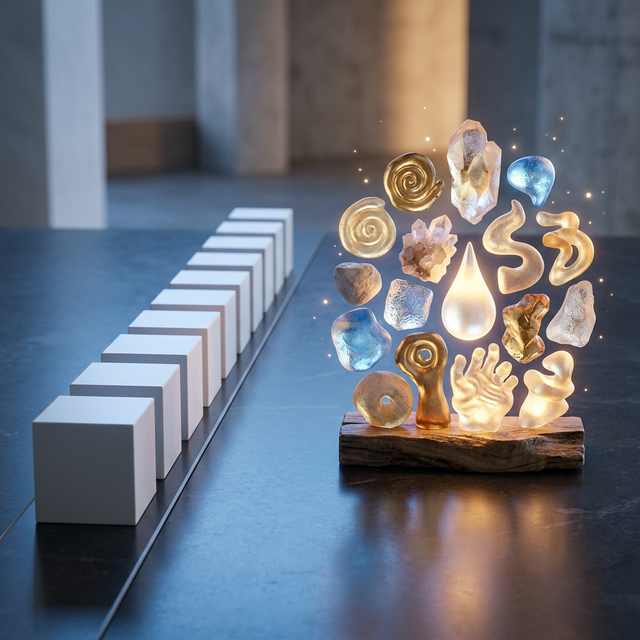
Luminous Accents: Using saturated colors to guide user focus in dark environments.
Pure black (#000000) is often a mistake for large backgrounds—it causes excessive contrast that tires the eyes. A deep blue-gray or "Obsidian" base provides a much smoother experience. In our feature sections and hero layouts, we use a palette that balances deep charcoals with high-impact neon accents.
Typography and Contrast
White text on a black background can "bleed" (halo effect). To maintain readability, we recommend using off-white or light-gray text and increasing letter spacing slightly. This is particularly important for text-heavy components like about sections or FAQ grids.
Implementing with Tailwind CSS
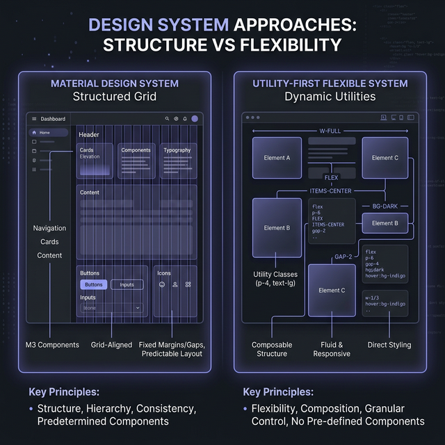
Implementing a dark-first system with Tailwind requires using the dark: variant extensively. However, the best approach is using CSS variables (CSS Custom Properties) for your background and surface colors. This allows for instant system-wide theme switching while keeping your accessible buttons and inputs perfectly themed.
Frequently Asked Questions
Is accessibility different in dark mode?
Yes! The contrast ratios are calculated differently. Use tools like the Adobe Color Accessibility tab to ensure your dark-mode palette meets WCAG AA or AAA standards.
Should I still offer a light mode?
Ideally, yes. While "Dark-First" is the priority, a high-quality application should support user preference and OS-level auto-switching.
Explore Dark-Optimized Components
Experience the Darkness
IndoUI is built dark-first. Our components are designed for high-end aesthetics, premium feel, and impeccable eye comfort in low-light environments.
Build the Future